Why Your Packaging Color Doesn't Match the Proof — and How to Get It Right
- shaolin mo
- 4 days ago
- 4 min read


After years of running a packaging print factory, I can tell you the most common complaint from new buyers isn't price or lead time. It's color: "This is wrong — it doesn't match what I approved."
Nine times out of ten, the printing is fine. The problem happened before the press ever ran, in how the color was specified, proofed, and approved. Here's why packaging color behaves the way it does, and what you can do to get a result you're happy with on the first run.CMYK and Pantone
Your screen is lying to you
Your monitor makes color with emitted light — red, green, and blue (RGB), added together. Printed packaging makes color with ink that reflects light — cyan, magenta, yellow, and black (CMYK), which works by subtraction. A screen glows; a printed box can't.
That difference alone explains most "it looked brighter on my laptop" complaints. A vivid, glowing color on your screen will almost always look more muted on paper. That's not a printing fault — it's physics. The screen is the unrealistic reference, not the print.
CMYK and Pantone are two different ways to make color
CMYK (process color) builds every color out of four ink layers printed as tiny dots that your eye blends together. It's how we print photographs and gradients. The catch: because the final color is assembled from four separate inks, a small shift in any one of them moves the result. That's why CMYK can drift slightly from one run to the next.
Pantone (PMS spot color) is a single ink pre-mixed to an exact recipe — like buying paint in one specific, named color instead of mixing it yourself each time. It's far more consistent run to run. This is what you use for brand colors, logos, and any solid color that has to look identical every time you reorder.
Simple rule: full-color artwork and photos → CMYK. Brand colors that must stay consistent → Pantone spot color. Most packaging uses a mix of both.
The same color looks different on different paper
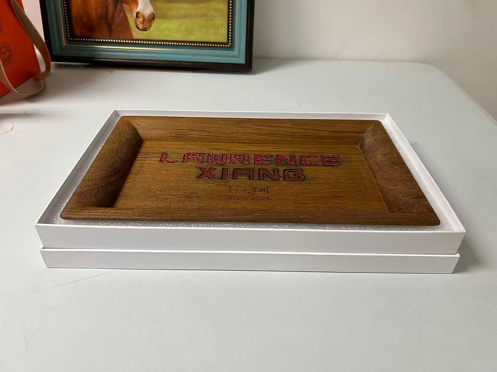
Ink sits on top of coated stock but soaks into uncoated and kraft board. The same Pantone number prints differently depending on the surface. That's why Pantone publishes separate guides — C for coated and U for uncoated — and why you should tell your supplier which one applies to your material.
If you're printing on brown kraft, accept that bright, clean colors are physically limited. The brown base shows through everything, so vivid blues and whites simply can't pop the way they do on white coated paper. Choose colors that work with your material, not against it.
"Exact match" is a range, not a single point
Even with everything under control, ink spreads a little on press (we call it dot gain), machines vary, and no two runs are atomically identical. In the trade we measure color difference as ΔE (Delta E). As a rough guide, a ΔE of about 2 or less is generally not noticeable to the human eye.
So "matching" really means within an agreed tolerance — not molecularly identical. A serious supplier holds a tight tolerance and is honest that a perfect, zero-variation match on every single run doesn't exist in the real world.
What you should do as the buyer
Specify Pantone codes for any brand-critical color, and state coated (C) or uncoated (U) to match your stock.
Never approve color from a screen or a PDF. Your monitor and office printer are not calibrated references.
Ask for a physical proof — a printed draw-down on your actual material — and approve that, not a digital file.
For repeat orders, keep one approved physical sample as your master. Every future run gets matched to that piece, not to a fresh file each time.
Tell your supplier which color matters most. On a busy design, it helps enormously to know the logo red is sacred and the background has room to move.
What a good supplier does on their end
A factory that takes color seriously will measure it with a spectrophotometer instead of judging by eye, check it under standardized D50 lighting (a box looks different under warehouse fluorescents than under showroom light — "it looked fine in my office" causes a lot of disputes), keep your approved standard on file, and tell you honestly before printing when a color can't be hit on your chosen material.
The bottom line
Color matching isn't luck or magic. It's specification, proofing, and process control — and most problems come from the first two, which are in your hands as the buyer. Get the Pantone reference right, approve a physical proof on your real material, and keep a master sample, and you'll eliminate the large majority of color surprises before they ever happen.
If you're sourcing custom printed packaging and want a supplier who'll tell you honestly what your color will actually look like — including when it can't be done on your chosen stock — that's how we work. Send us your artwork and Pantone references, and we'll proof it on your real material before we run a single box.


Comments